top of page

Search


How to Use Pairwise Correlation Plot and Sweetviz in Python Data Analysis for Effective Insights.
Sweetviz, a powerful Python library that serves as a valuable tool for data analysis in the realm of data science. Sweetviz, which...
Oct 31, 20232 min read
481 views
0 comments


Python Seaborn Data Analysis Tips - Figure level vs Axes level plots
DataSimple.education Certifications Data Analysis, Pandas, Seaborn, Plotly and More The figure-level plotting tools, relplot , displot ,...
Jun 21, 20233 min read
439 views
0 comments
Python Data Analysis Tips - Conditional kernel density Estimate
DataSimple.education Certifications Data Analysis, Pandas, Seaborn, Plotly and More Seaborn is a popular Python data visualization...
Jun 15, 20232 min read
355 views
0 comments


Seaborn Python Data Analysis Tips - Override and Customize Seaborn Style
DataSimple.education Certifications Data Analysis, Pandas, Seaborn, Plotly and More Seaborn is a powerful Python library for data...
Jun 6, 20232 min read
601 views
0 comments


Python Data Analysis Tips 3D Scatter in Ploty Interactive 3D Data Analysis
DataSimple.education Certifications Data Analysis, Pandas, Seaborn, Plotly and More I was so excited to try the 3D scatter plot in...
Mar 18, 20231 min read
1,684 views
1 comment


Python Data Analysis Tips - Plotly histogram add boxplot and count
DataSimple.education Certifications Data Analysis, Pandas, Seaborn, Plotly and More In Python, Plotly is a great tool in data analysis...
Feb 13, 20231 min read
332 views
1 comment


Python Data Analysis Tips -Detailed Distribution histoplot, kdeplot, stripplot, axvline with Seaborn
DataSimple.education Certifications Data Analysis, Pandas, Seaborn, Plotly and More
Feb 8, 20232 min read
1,880 views
1 comment


Python Data Analysis Tips - Plot on both left and right axis in Pandas
DataSimple.education Certifications Data Analysis, Pandas, Seaborn, Plotly and More in Python Pandas is the fastest and easiest to use...
Feb 5, 20232 min read
647 views
1 comment


Python Data Analysis Tips - How to plot many histograms in Pandas without a For loop
DataSimple.education Certifications Data Analysis, Pandas, Seaborn, Plotly and More Learn more about plotting high dimensional data...
Feb 1, 20231 min read
1,315 views
1 comment


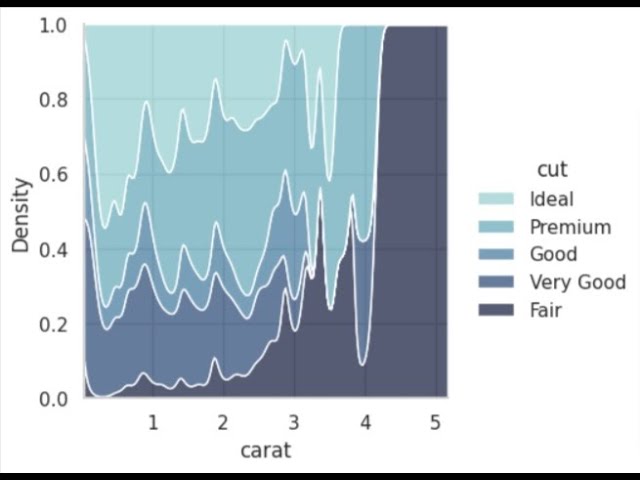
Python Data Analysis Tips Pandas areaplot how when why to use the areaplot in Pandas
DataSimple.education Certifications Data Analysis, Pandas, Seaborn, Plotly and More The area plot in Pandas is a specialized plot that...
Jan 30, 20231 min read
345 views
0 comments


Python Data Analysis Tips - barplot Seaborn change outline color edit patches
DataSimple.education Certifications Data Analysis, Pandas, Seaborn, Plotly and More In Python learn how to use the barplot . This...
Jan 27, 20231 min read
318 views
0 comments


Python Data Analysis Guided Project - Analyze Dog Breeds, Level 2, 31 min
DataSimple.education Certifications Data Analysis, Pandas, Seaborn, Plotly and More In this Python data analysis guided project, we will...
Jan 20, 20233 min read
1,494 views
0 comments


Python Data Analysis Tips - Anomaly Detection Plot in Seaborn
DataSimple.education Certifications Data Analysis, Pandas, Seaborn, Plotly and More In Python with Seaborn learn how to make an anomaly...
Jan 18, 20232 min read
3,579 views
0 comments


Python Data Analysis Guided Project - Netflix Movies, Seaborn, Pandas, WordCloud Level 5, 33min
DataSimple.education Certifications Data Analysis, Pandas, Seaborn, Plotly and More Use your Python data analysis skills to better...
Jan 13, 20231 min read
1,744 views
1 comment


Python Data Analysis Tips - StripPointPlot in Seaborn, Combine strip and point plots on a FacetGrid
DataSimple.education Certifications Data Analysis, Pandas, Seaborn, Plotly and More In Python Seaborn is a powerful analytical tool. ...
Jan 12, 20231 min read
266 views
0 comments


Python Data Analysis Tips - How and why to make a Ridge Plot in Seaborn
Distributions are very important to understand when building a machine or deep learning model. Seaborn's histplot is great for these...
Jan 4, 20231 min read
908 views
0 comments


Real Python Data Analysis Guided Project - Google Forms Survey Response Analysis, Level 3, 21 min
DataSimple.education Certifications Data Analysis, Pandas, Seaborn, Plotly and More Use Pandas and Seaborn in Python to analyze the...
Dec 31, 20221 min read
1,148 views
1 comment


Python Data Analysis Tips plot all your distributions in one for loop categorical numerical Seaborn
DataSimple.education Certifications Data Analysis, Pandas, Seaborn, Plotly and More Learn how to plot all of the distributions,...
Dec 29, 20221 min read
576 views
0 comments


Python Data Analysis Tips - plot all your distributions in one for loop, category and numeric Pandas
Learn how to plot all of the distributions in your DataFrame in one for loop. we will use Pandas to quickly and easily plot all of the...
Dec 29, 20221 min read
423 views
0 comments


Python Data Analysis Tips when how to use the diverging palette versus light palette in Seaborn
Learn how to and when to use the diverging palette in Seaborn. The light and dark palettes are monochromatic in that they only have...
Dec 28, 20221 min read
268 views
0 comments
bottom of page